
.png)
AlgoRaven is an online platform for crypto algo trading.
My Role
Sole Digital Designer
Brief
Redesign the logo & landing page in time for public beta launch. Design content and create an updated visual style to bolster sign up count.
Team
1 Product Manager, 2 Full-Stack Engineers
Programs Used
Figma, Adobe Illustrator
Platform
Desktop
1. Why Redesign?
Background
AlgoRaven, under BitBird Inc., is an up and coming crypto algo trading service with a focus on simplifying the algo trading experience. With a significant rise in crypto trading over the last year; total crypto market cap growth by 187.5%, their idea was to develop a simple, easy and clean product that helped people both better understand and trade crypto.
The AlgoRaven team is a startup company of 3 founders; CEO, CDO and their Lead Product Manager. Their early landing page design was shown to have overall negative user feedback with low sign up count. A new design was needed for their public beta.
An open call for volunteer designers was posted via LinkedIn and I was chosen after applying and passing their design interview/prompt.
2. The Problems?
What does this product do?
Early user feedback has shown an overall negative take on the current homepage design. New users especially, who aren’t familiar with algo trading, have no idea what the product does, leaving the user confused and uninterested.
How does it work?
A section briefly describing/showcasing how the product works was missing. Screenshots weren’t enough for users to fully understand the product.
Why should you sign up?
Aside from the visual differences, AlgoRaven needed to showcase what made them different from other algo trading services, and why they were worthy of a sign up.
Old Landing Page Design:

Notable Early User Feedback
“The logo doesn’t remind me of a raven at all”
“I don’t really know what this product does”
“The overall design doesn’t really catch my eye”
“It doesn’t look professional enough in my opinion”
Visual Design Problems
-
Missing a clear CTA (Call to Action)
-
Landing page is not visually interesting enough
-
Feature pages stand out more than the landing page
-
Icons aren’t cohesive with the overall brand
-
Feature descriptions get lost due to both size and color
-
Inconsistent color value of animated bubble
-
Screenshots sizes are too small
Content Problems
-
Call to actions are the same; “Sign In” & “Log In”
-
Missing a brief summary of the product
-
Missing a brief “How it Works” section
-
Missing an “About Us” section
-
Missing a “Live Trading” section
-
Missing an “Exchanges Supported” section
-
Search bar should only be visible after user logs in


3. Design Process
Competitor Analysis
With the team, we went over a handful of our competitor websites to analyze what was missing with their own. A drastic difference was observed both in the visual elements as well as the content provided. Clear visual hierarchies, clear call to actions, easy to read content, simple navigations, and an overall professional/inviting presence were needed.
Brainstorming
I met with the team via Google Meet to discuss early user feedback along with their GTM strategies, to narrow down the specific changes we’d need to either remove or implement in the landing page. Of these changes, 2 were the most needed; a module showcasing the product’s Recipe Editor, and a module advertising the Live Trading feature currently in development. For the Recipe Editor module, we needed to include a brief step by step guide, explaining fully to the user what exactly it is and does. And for the Live Trading module, we needed a way to advertise its features as well as the exchanges that would be supported, along with a CTA to sign up for the waitlist.
Design Brief
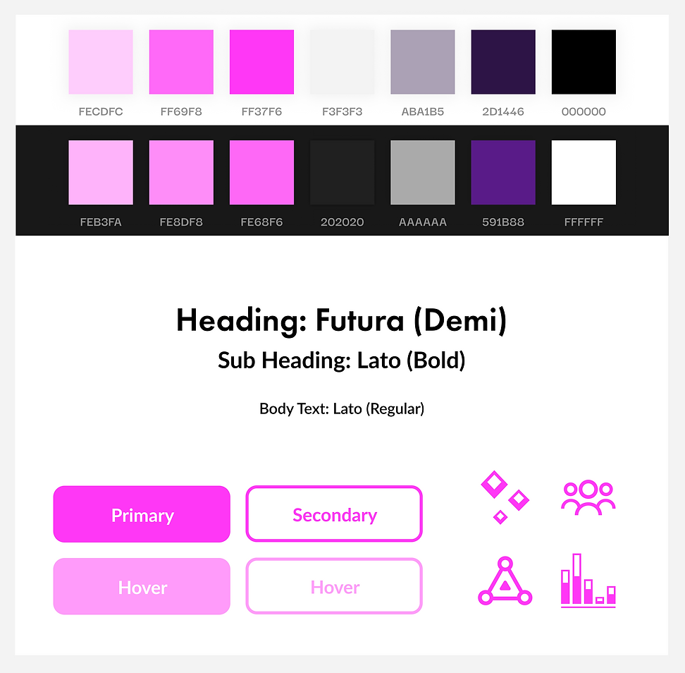
Redesign the product’s logo and landing homepage with a clean minimalist/modern style. Introduce a new visual system that, if successful, would take over as the current visual system and be carried out throughout the rest of the website and its features.
Information Architecture:

Wireframes
I was instructed to create a couple medium-fidelity wireframe designs within the time span of one week, and have the best ones ready to showcase for a design crit by the end of that week. With all the necessary information gathered, I designed 4 quick grayscale wireframes to organize the new modules and features previously discussed. We met via google meet for the design crit, and the group ultimately favored Wireframe 2 (Second from the left). I was then given access to the company’s figma file to further develop that wireframe into a high-fidelity mockup with ongoing feedback from the team.


4. Final Designs


5. Results (Site stats within the first week of public beta launch)

6. Key Takeaways
Designing is a Process
Whether it’s designing a simple logo, to an entirely new homepage, designing takes multiple iterations and time. Trust the design process and don’t get too overly attached to any one design along the way.
Simple Design is Important
Designing something like a landing page can open your mind to many design possibilities and creative ideas. In the end, a design that’s simple, clean and can easily be navigated is a powerful outcome. Remember that design should always enhance function.
*After completion of this job, the founders offered a co-founder position for me within the company as the sole UX/UI & Digital Designer, where I would help in redesigning the rest of the product’s web pages/features.
