

Swatchit is a concept app for painters, illustrators and artists alike, aimed to make painting easier by providing personalized color swatches and references.
My Role
Solo UX/UI Designer
Brief
Design an app that makes the color palette discovery process easier for artists.
Programs Used
Figma, Illustrator, Photoshop, After Effects, Blender
Platform
Mobile
Responsibilities
UI Design, Logo Design, Prototyping, User Flow, User Research, Information Architecture, 3D Rendering

1. Why the Need?
Background
The need to understand color is one of the most essential tools a learning artist must hone when creating original art. Color theory is taught to artists, but it’s up to the individual to experiment with paint and/or digital media to remember those color relations. And when an artist needs specific color reference, it’s up to them to either find, or photograph it themselves. Color mixing apps exist, but a visual representation isn’t present, forcing the artist to work out the relations themselves. With this problem showing up during my personal art sessions, I wondered if other fellow artists felt the same way. And it turned out that I wasn’t alone.
Hypothesis
A tool that helps visualize the relationship between customized colors through the use of real-time 3D rendering and color swatch deliverables.
2. Research
Competitor Research
Of the software/apps that dealt with color mixing and swatch creation, I found that they were missing an important element; a visual representation of the colors created. Different colors have different values, therefore just having a swatch of colors would leave it up to the artist to discern between those differences. Having a proper visual representation would help the artist organize those colors better when painting, resulting in realistic color shading.
User Interviews
To first find out if this was a common problem shared amongst artists, I interviewed a mix of 5 artists that I personally know (student & graduated). I asked them about their level of knowledge on color theory, their process about choosing colors and color references, and whether or not they would or currently use a color swatch app or software. In the end, some key commonalities were found amongst them.
Age Range: 21-28
Occupation: BFA Student/Freelance Artist/Animator/Hobbyist
Common Software/App Used: Instagram, Pinterest, Photoshop, Illustrator, Procreate
Traditional Medium: Acrylic/Watercolor/Oil/Gouache
-
Unconfident in their knowledge of color theory
-
At times feel that they spend too much time collecting color reference and searching online
-
Don’t want/have the time to use their paints/supplies to experiment with color theory
-
Are sometimes unable to photograph their own color references

3. User Flows & Wireframes
Version 1.0
The user flow and wireframes at this stage were designed to solve three main problems; a way for users to create their own personalized swatches, save them, and display them as reference on their phone screens to use while they paint.

Version 2.0
After the first initial wireframe critique, the user flow and wireframes at this stage were designed to adapt to the interviewees' shared idea; a social platform to view, save, and discover swatches from one artist to another.

 |  |  |
|---|---|---|
 |  |  |
 |  |  |
 |
Information Architecture:

4. Design
Process
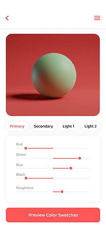
My design process began with the key desirable features expressed by the interviewees; a simple, clean way to create, view, and edit custom color swatches (Swatch Editor & Swatch Viewer). From there, other screens were designed to fit the previously established style. Common software/apps amongst the artists interviewed were looked at for inspiration, and elements from Photoshop, Procreate, and Instagram were mimicked in some areas for familiarity.
Inspiration Moodboard

Final Designs
My design process began with the key desirable features expressed by the interviewees; a simple, clean way to create, view, and edit custom color swatches (Swatch Editor & Swatch Viewer). From there, other screens were designed to fit the previously established style. Common software/apps amongst the artists interviewed were looked at for inspiration, and elements from Photoshop, Procreate, and Instagram were mimicked in some areas for familiarity.


_1.png)

.png)


Live Mock - Ups


Visual System

High-Fidelity Prototype:
5. Key Takeaways
Trust the Process
I found myself at times wanting to jump straight into the visual design, coming up with new ideas that although excited me, were different than the initial wireframes presented. Having ideas is great, but sticking to what the users desired is more important.
The Power of Prototyping
While presenting wireframes to the users, at times some features like the swatch editor and swatch viewer were a bit confusing to them. However, after showing them the high fidelity prototype, the app’s features became much clearer.
